Grantski Records
Brand Identity • Merchandising
Objective
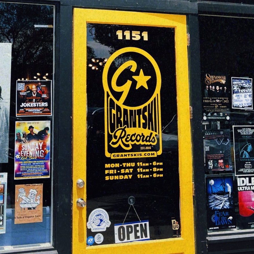
This case study examines the growth of Grantski Records from a small retail shop to a recognized record store and local music venue in Augusta’s downtown community. Since 2016, I’ve had the opportunity to support their evolution by helping shape their brand identity and marketing strategy. Through signage, storefront displays, and promotional materials, my focus has been on enhancing their visibility and creating a cohesive brand presence. This study highlights the impact of thoughtful brand identity and marketing in strengthening a local business and fostering a vibrant music space.
Scope of Work
Brand Identity & Strategy – Establishing visual identity and marketing approach for stronger community presence.
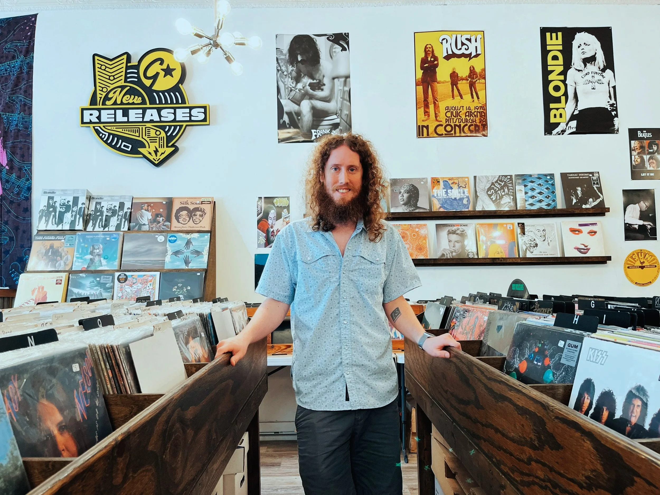
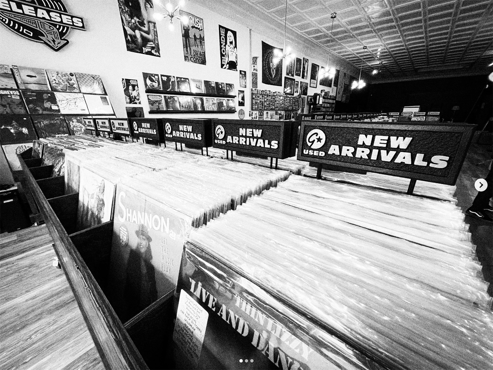
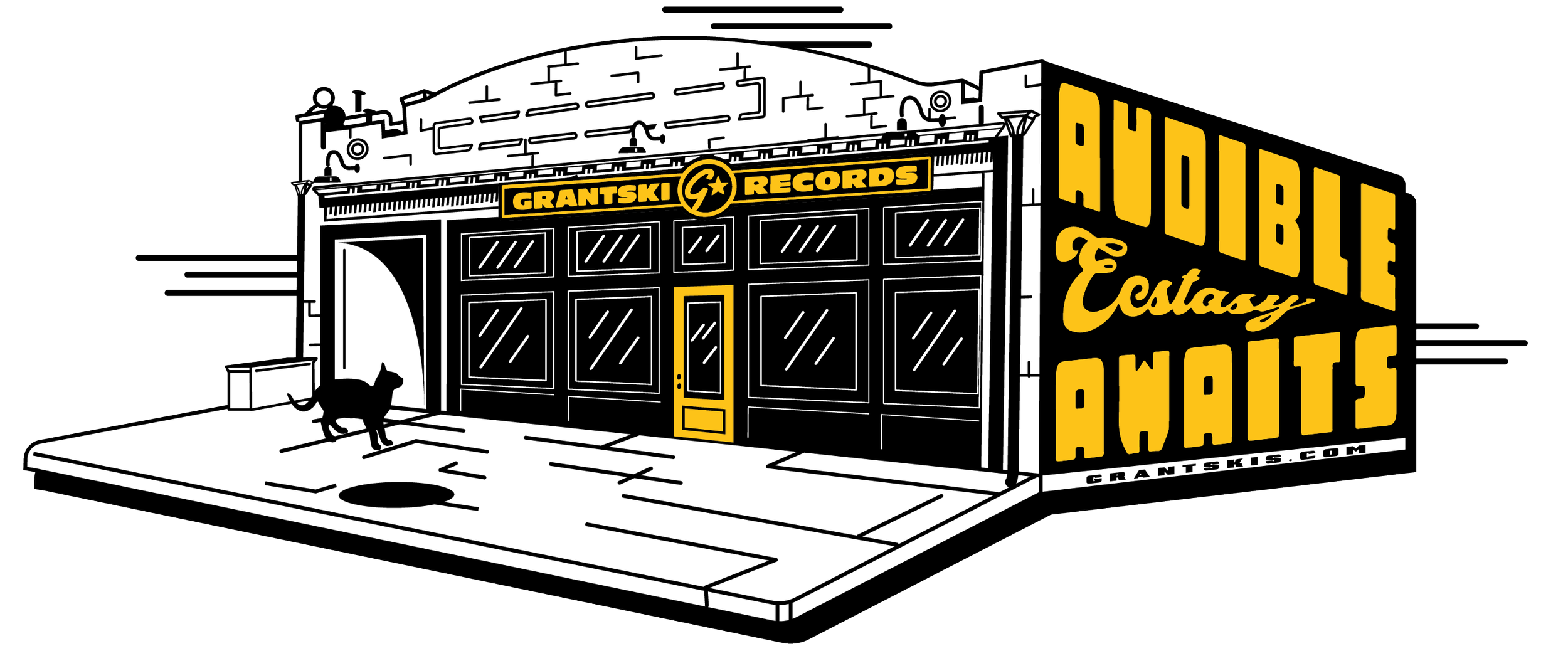
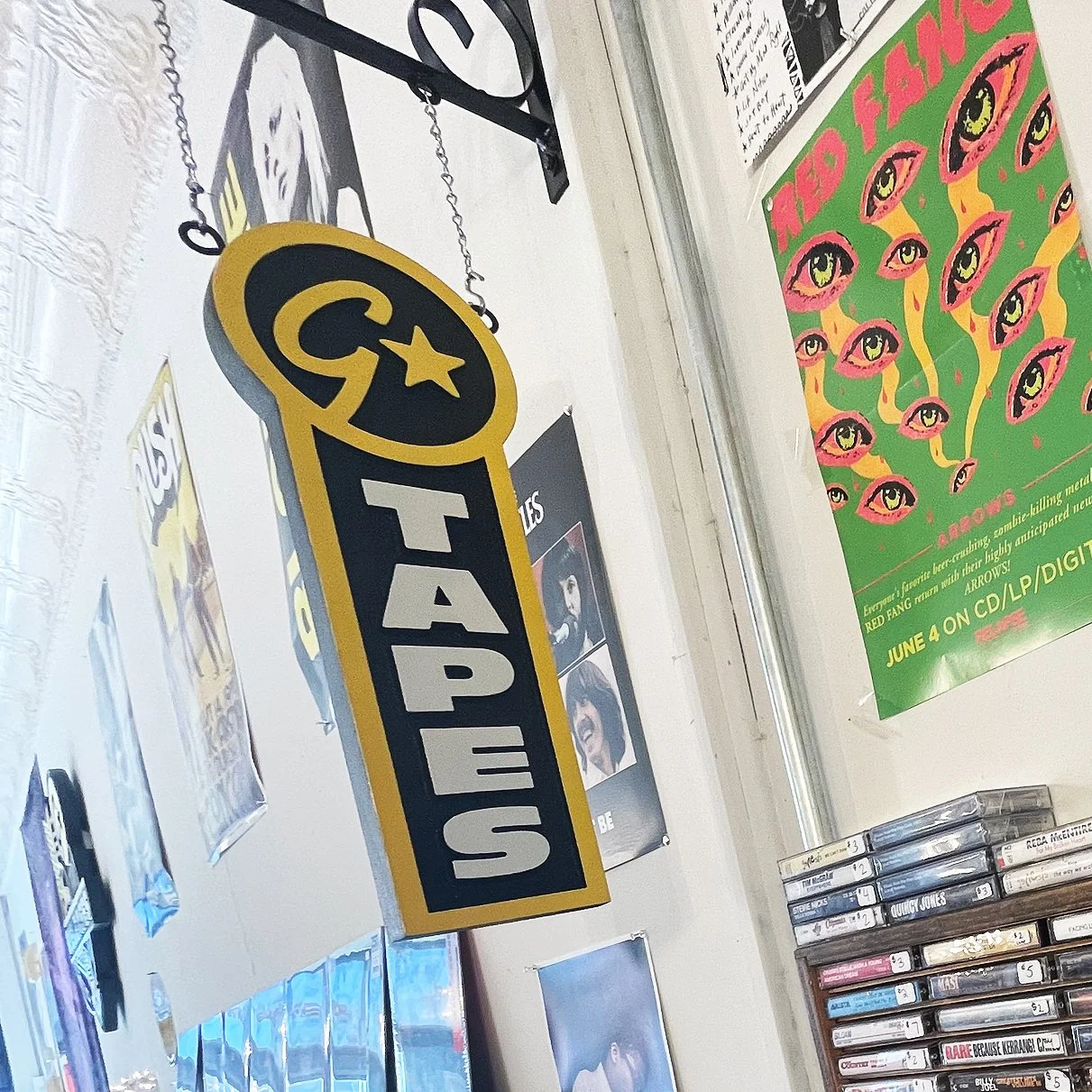
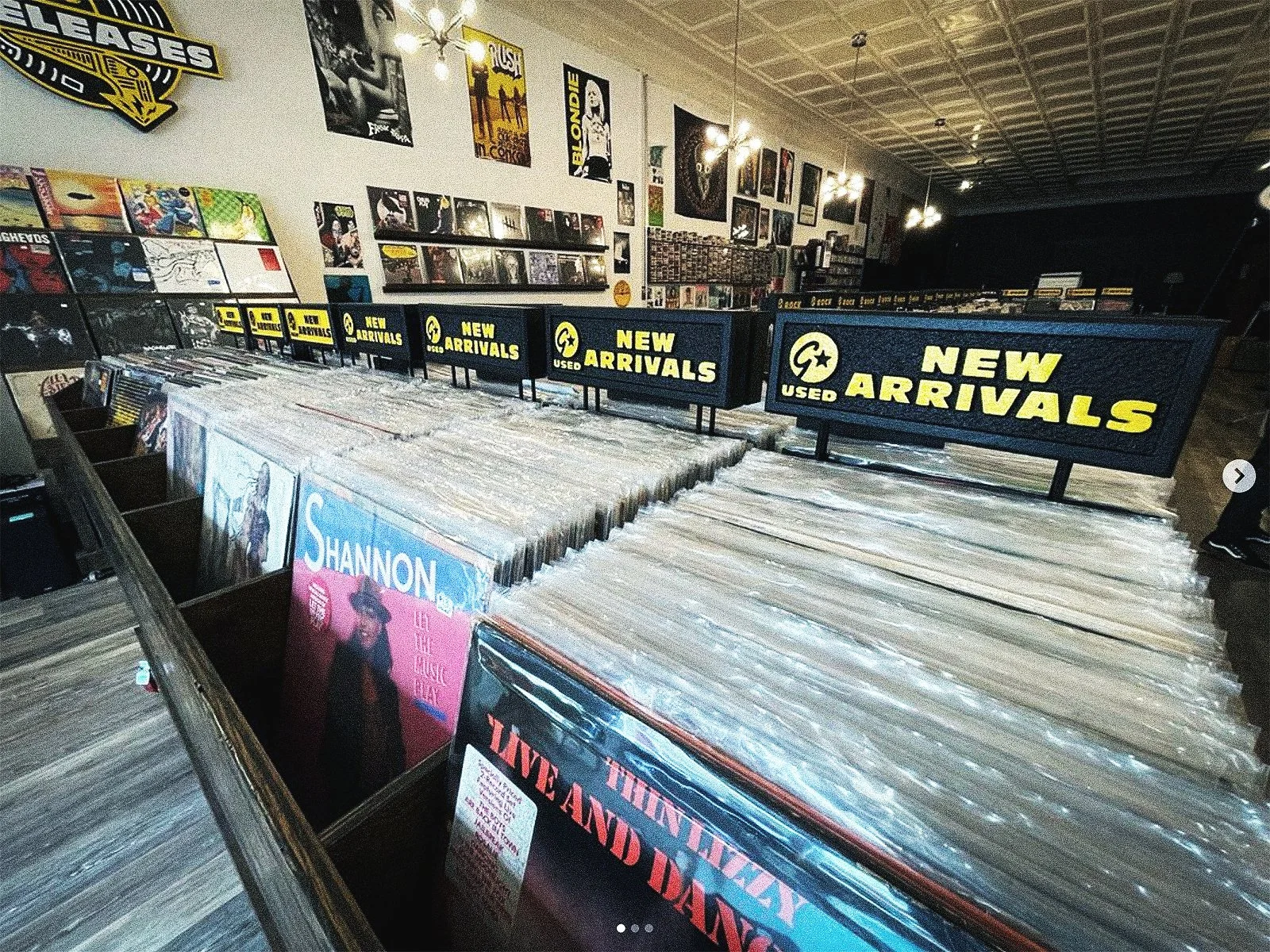
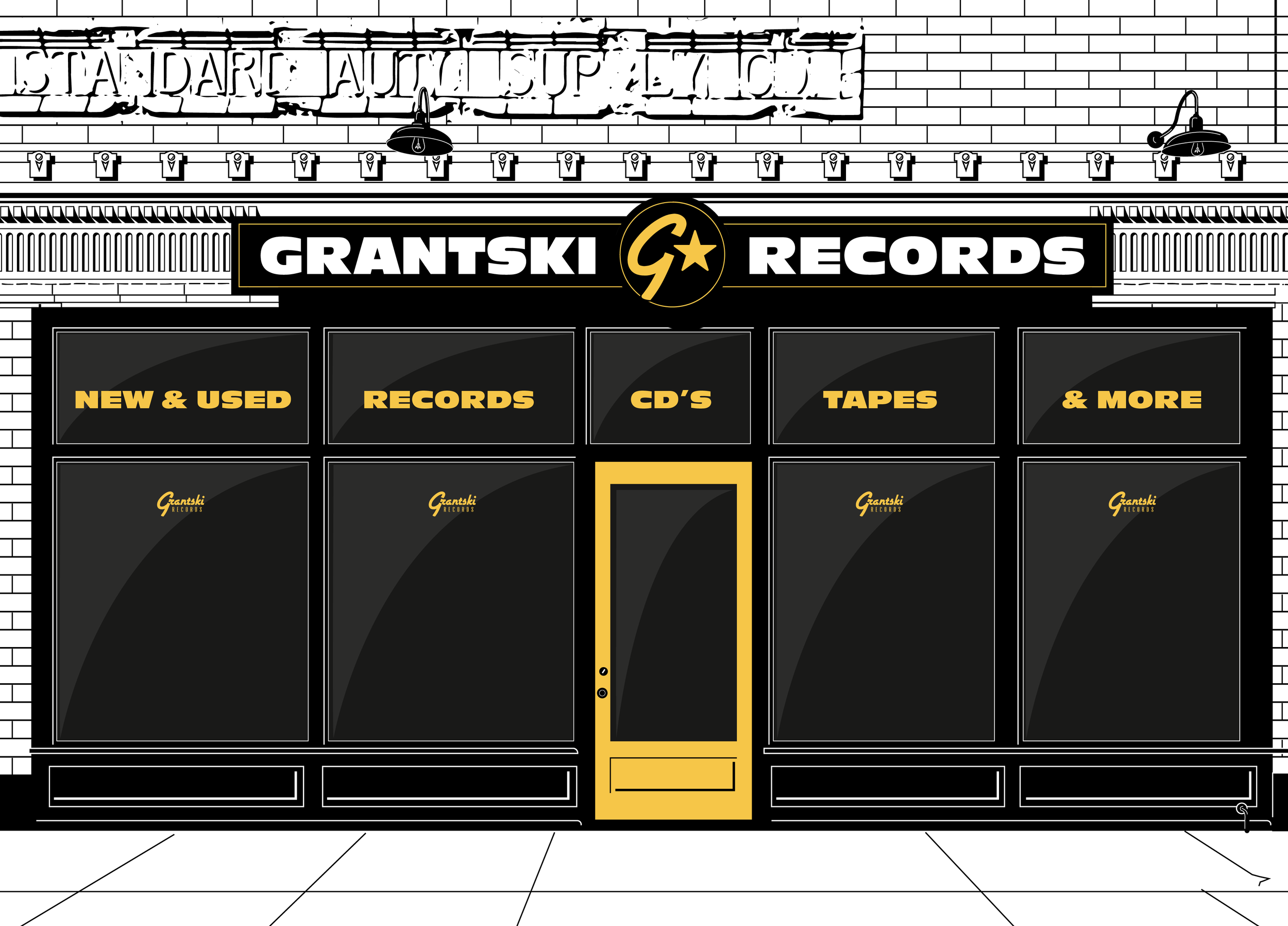
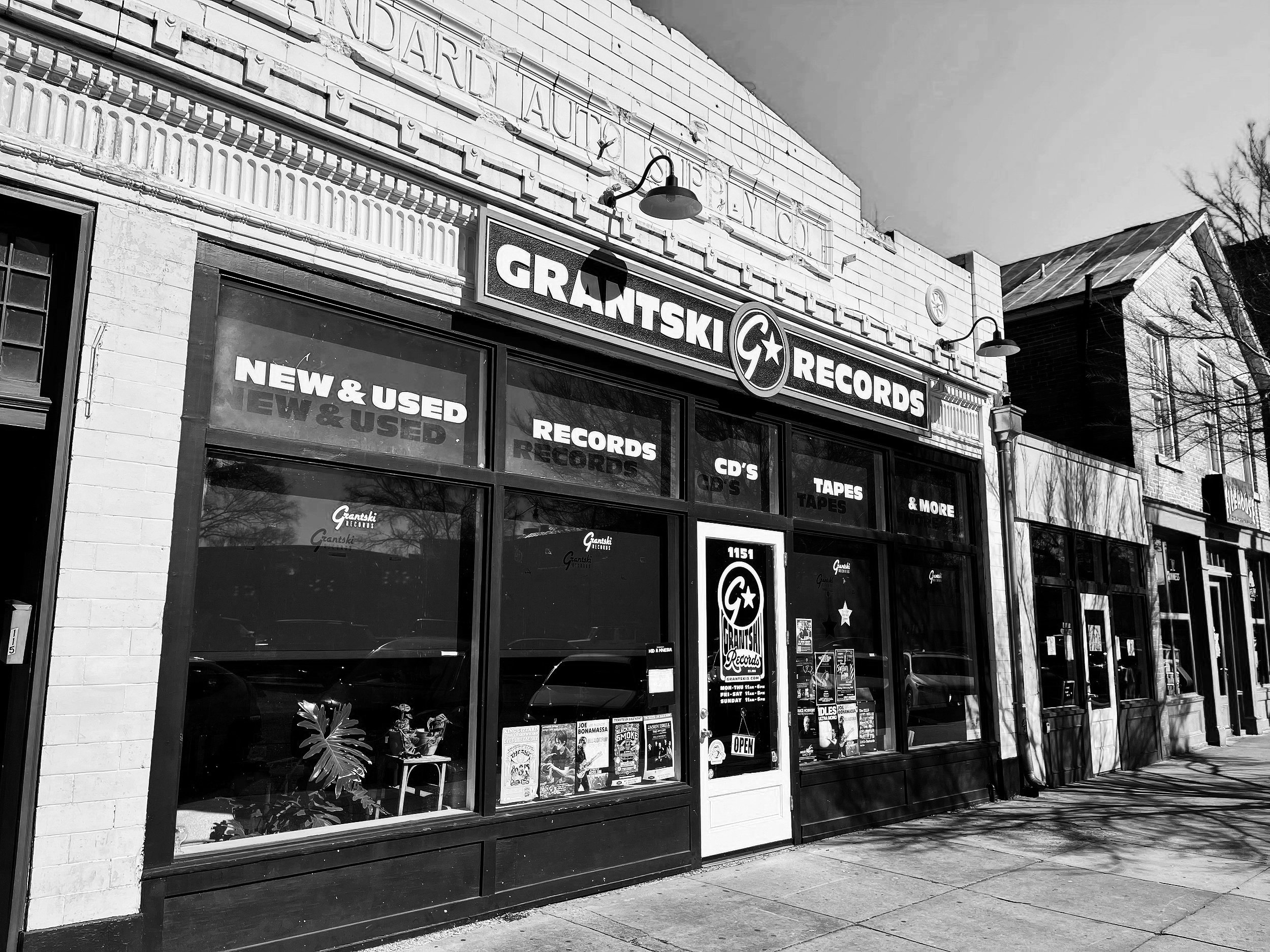
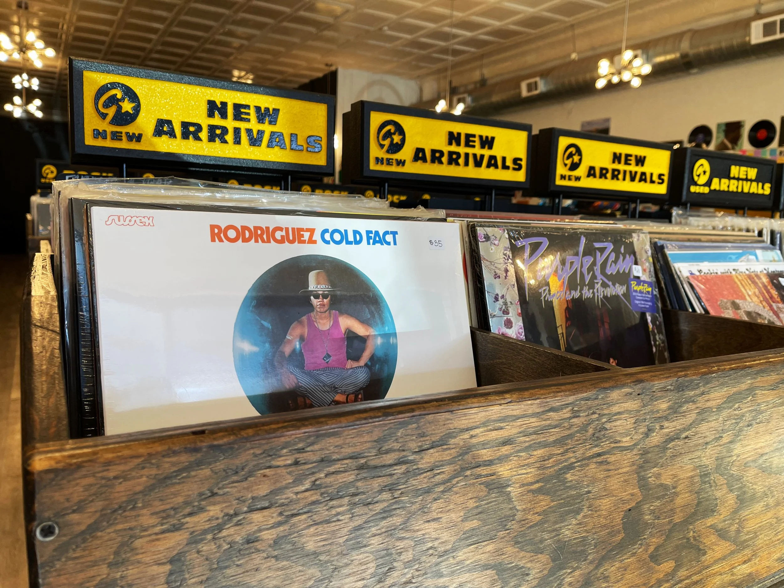
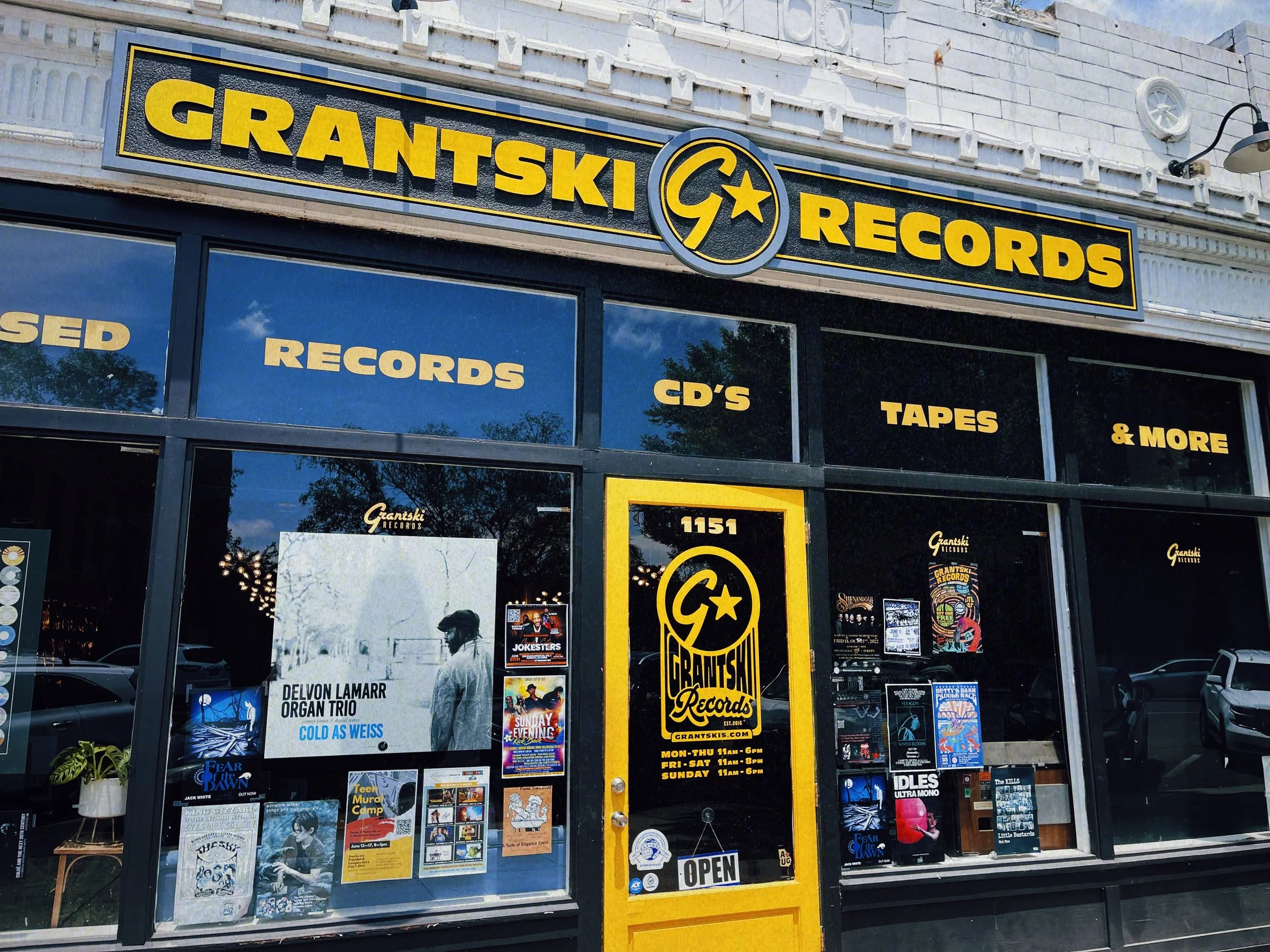
Signage – Creating eye-catching exterior and in-store signage.
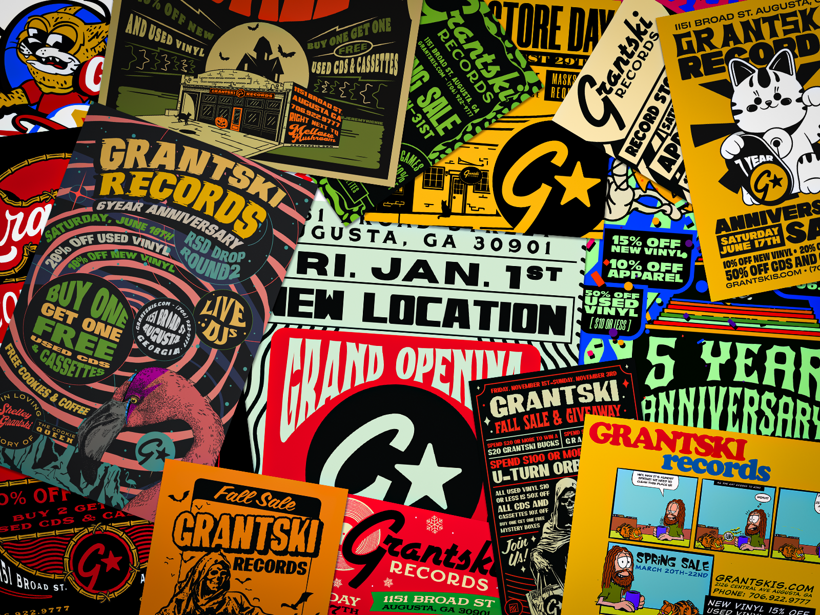
Promotional – Designing flyers, posters, and digital assets for events and activations.
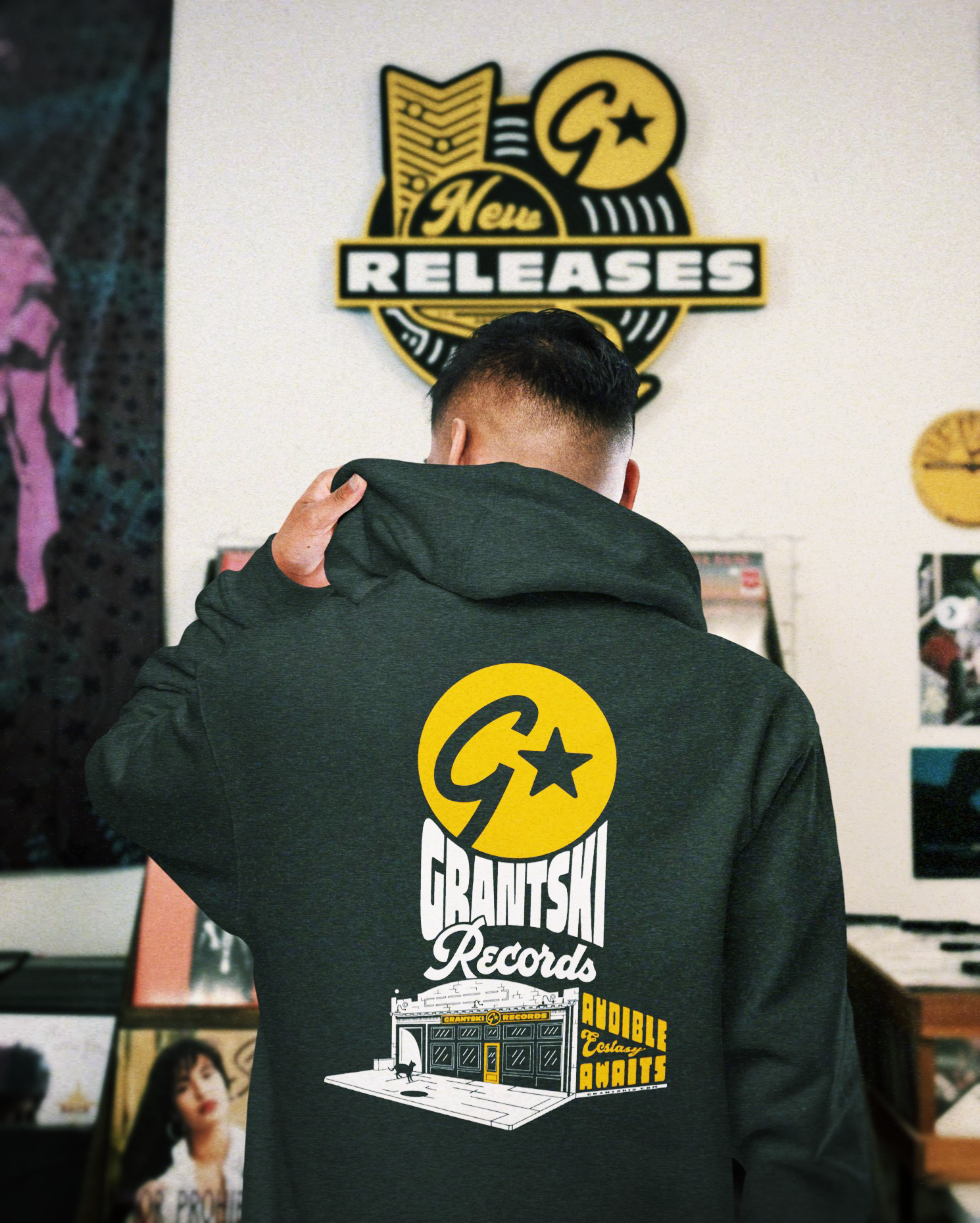
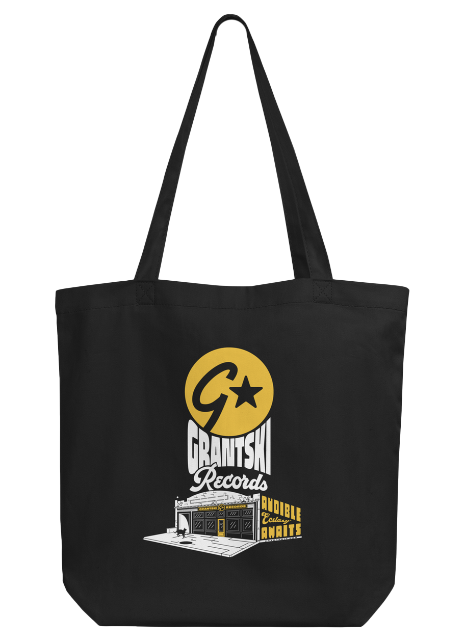
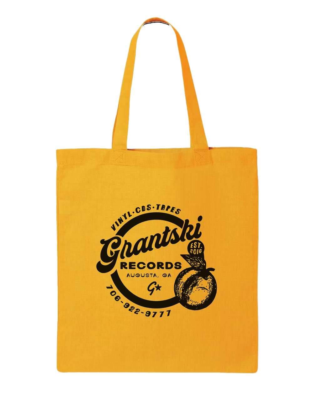
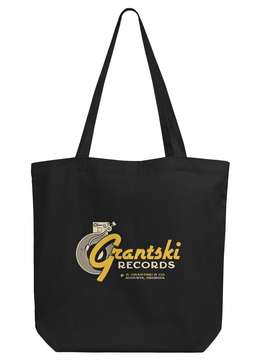
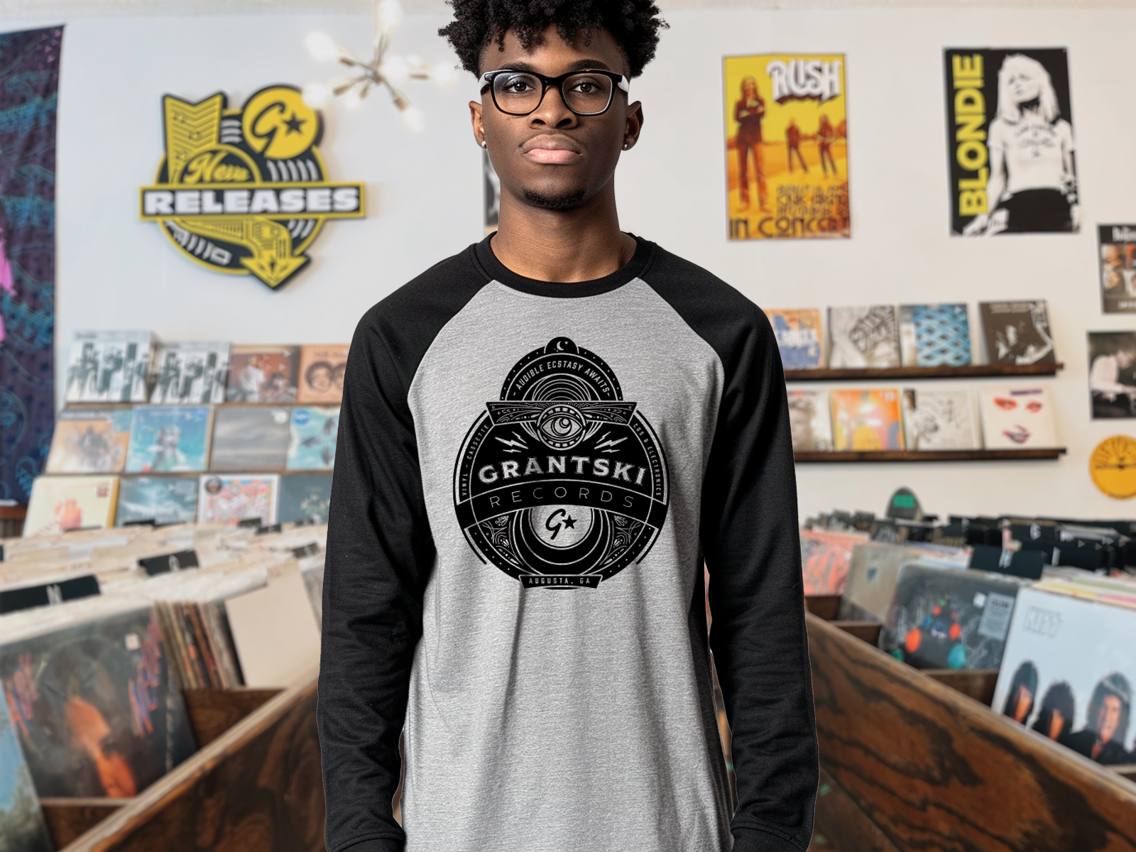
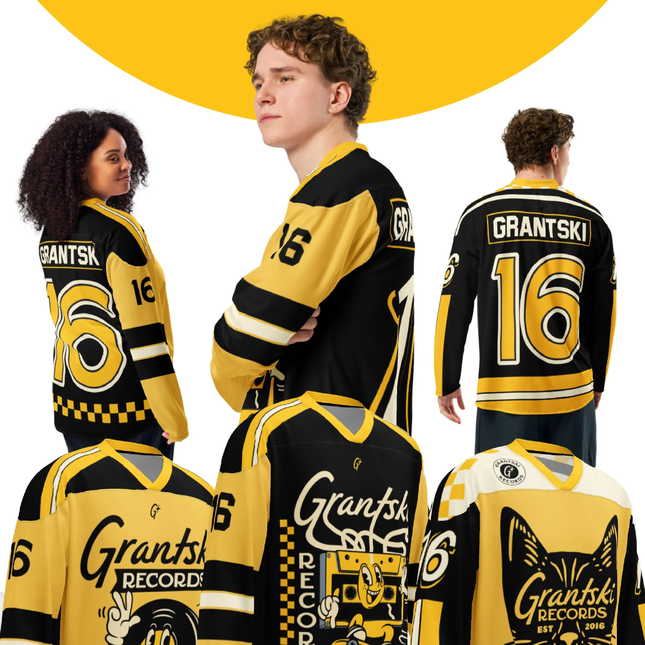
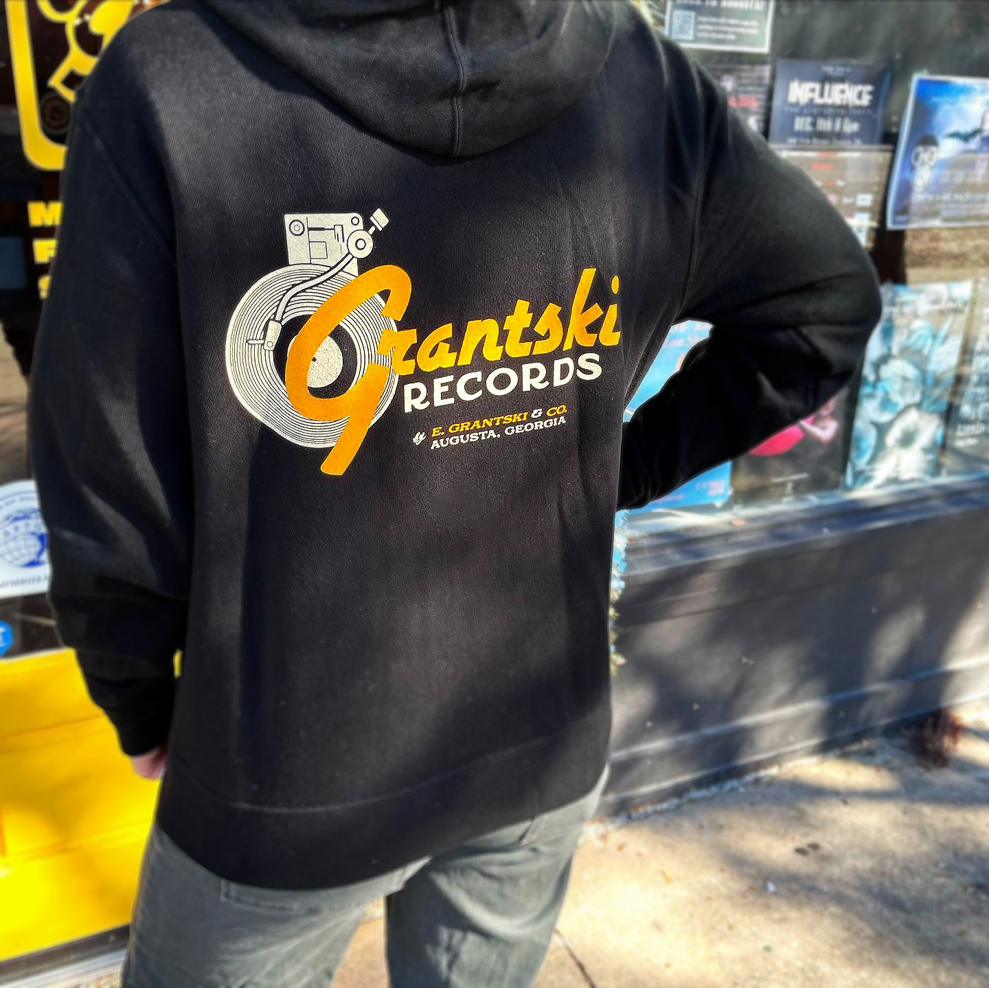
Merchandise – Developing branded apparel, accessories, books and misc products.
Web Design – Designing an engaging online store to enhance digital sales and brand reach.
Digital & Social Media – Crafting online visuals for social media, e-commerce, and digital promotions.
The Process
The branding process for Grantski Records has been a collaborative journey, evolving alongside the store’s growth and changing needs. Beginning in 2016 with a logo and basic marketing materials, the project expanded as Grantski outgrew its first location, requiring event flyers, merchandise, signage, and a cohesive brand identity. Over time, Grantski entrusted me with nearly full creative control, enabling a streamlined, consistent approach to visual identity and marketing. This iterative process has transformed Grantski into a dynamic, community-driven brand.
Brand Foundation
Long-Term Collaboration
Creative Leadership
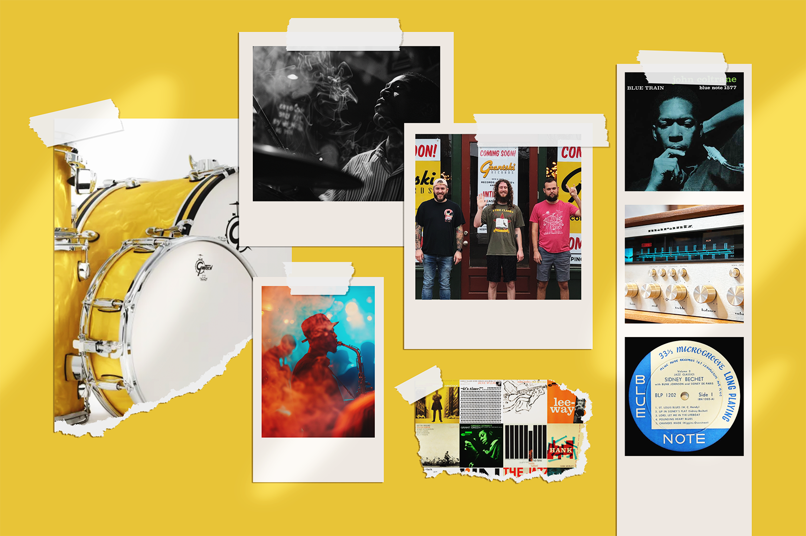
Inspiration
The inspiration behind Grantski Records’ visual identity was crafted to integrate seamlessly into the atmospheres of the moodboard while maintaining versatility across genres and styles. Drawing from the energy of live jazz, the charm of vintage record jackets, and the warmth of mid-century vinyl labels, the brand was designed to thrive in nostalgic and dynamic spaces. The pairing of script and sans serif fonts reflects jazz’s golden era while adapting to other musical styles. Anchored by a bold yellow-and-black palette, the identity is strong yet flexible, resonating across both local venues and digital platforms.

Brand Identity
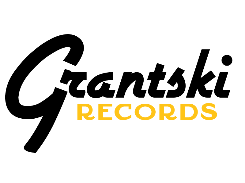
Primary logo

Icon logos
Secondary logoBRAND COLORS
Skooli
Blackwax
Sugarflake
Cupreme
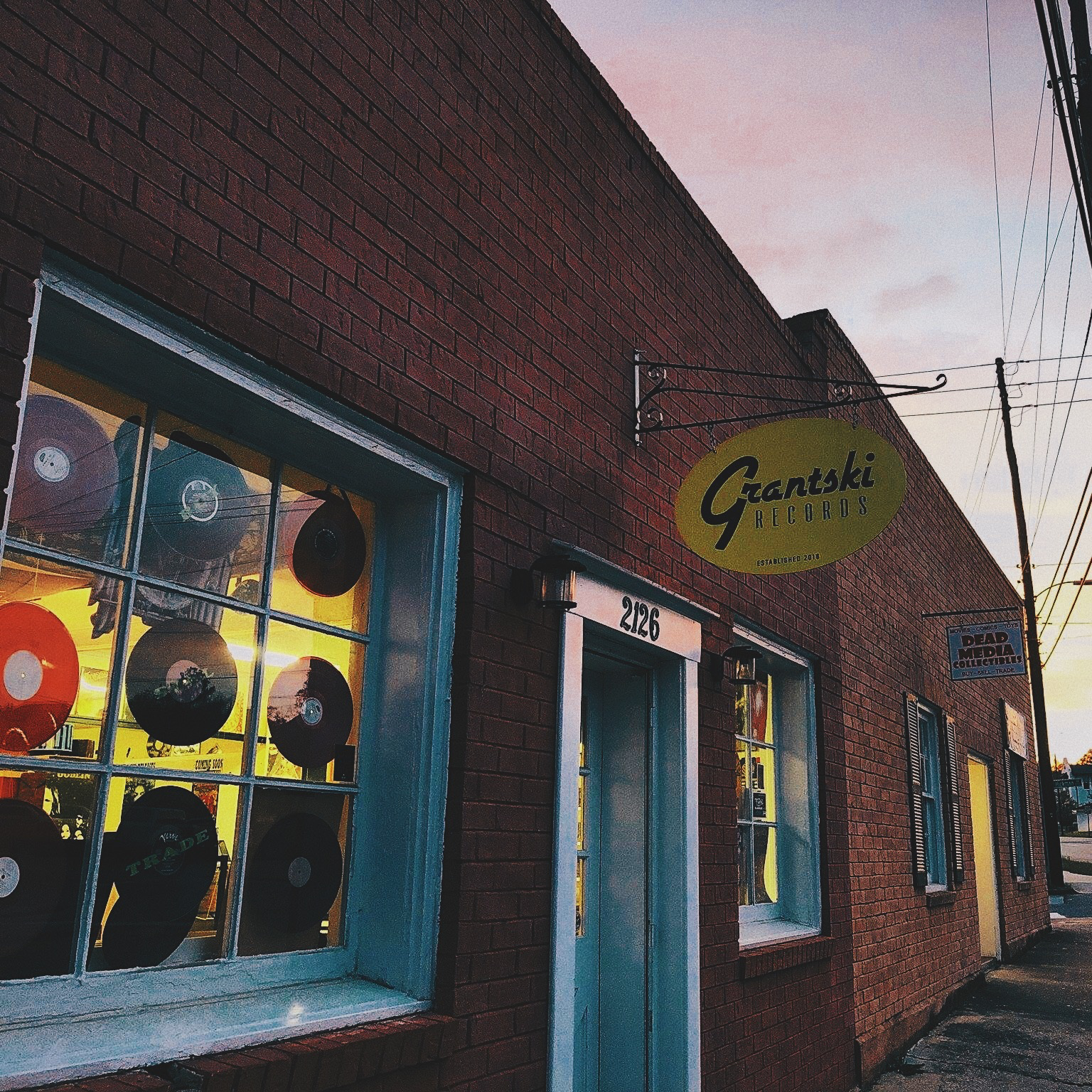
First Grantski Records Location 2016