blanton’s bourbon
Limited Edition Bottles
La Maison du Whisky x Whisky.fr | VI M&P Wine and Spirits
Objective
Develop a cohesive exclusive single-barrel release concept for La Maison du Whisky × Whisky.fr that elevated perceived rarity and cultural relevance through retailer-specific label design, while simultaneously extending the visual system into a VI M&P Wine and Spirits Festival presence.
The objective was to position the release as a curated, location-specific artifact rather than a mass-market product, using restrained design, geographic specificity, and minimal narrative to communicate value and exclusivity.
Scope of Work
In collaboration with Bill Michul at BORN Agency, the scope included:
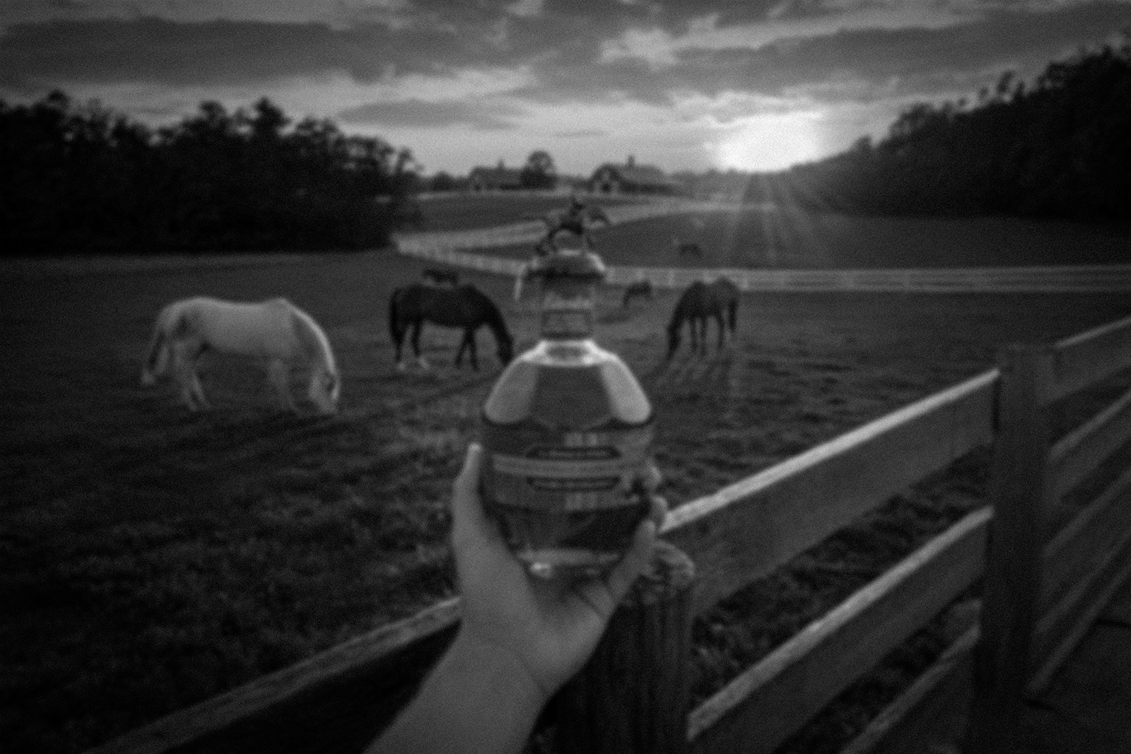
Concept development for an exclusive single-barrel release aligned with La Maison du Whisky’s curation philosophy using a Kentucky Derby theme.
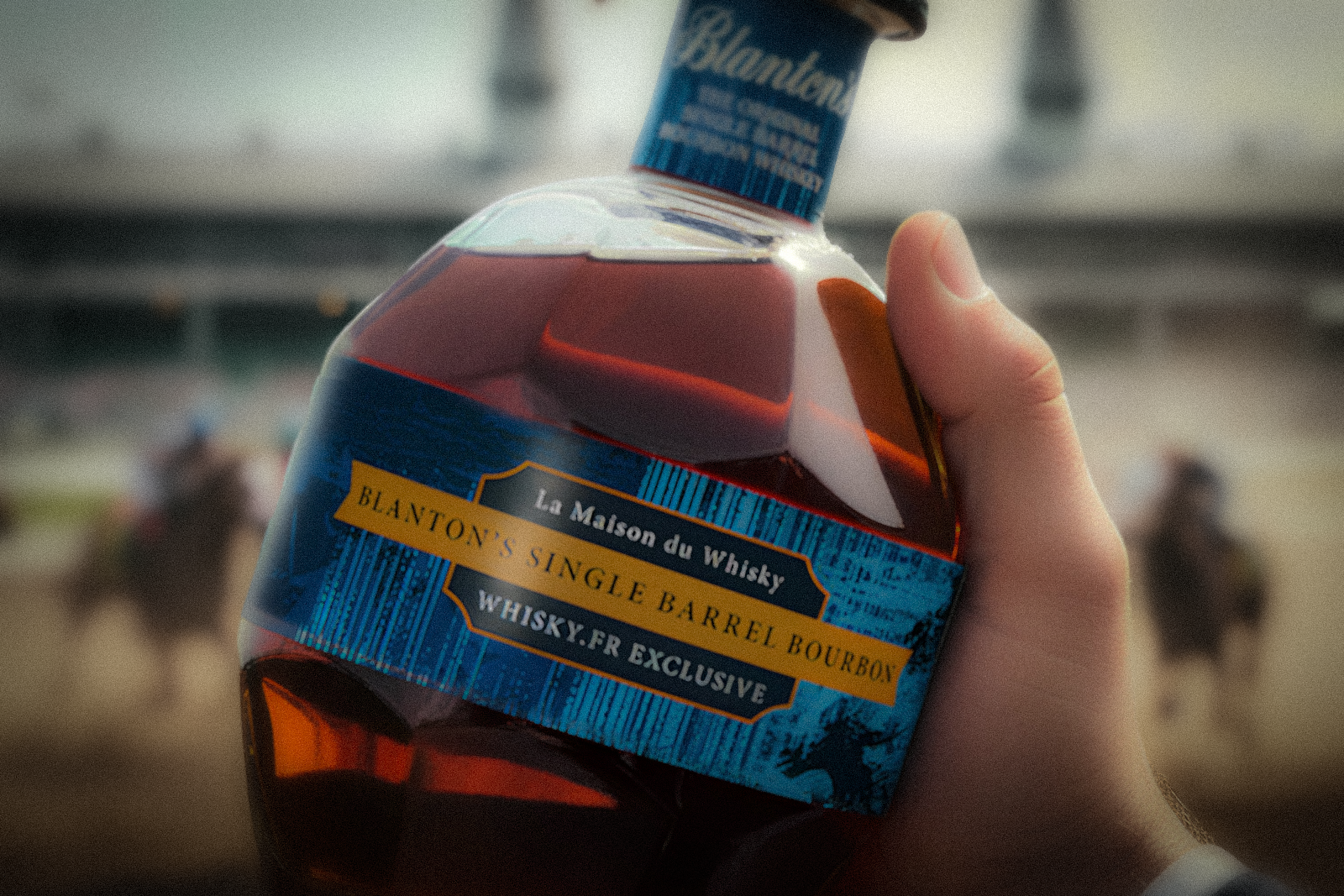
Design exploration and execution of a custom retailer-specific label, distinct from standard Blanton’s packaging while remaining brand-respectful
Visual positioning focused on modern European luxury cues, restraint, and authority, avoiding overt heritage tropes
Alignment of the bottle design with a broader VI M&P Wine and Spirits Festival visual presence to ensure cohesion across retail and experiential touchpoints
-
SILVER - Issued by American Advertising Federation (AAF) - Lexington · Feb 2015
Packaging - Single Unit
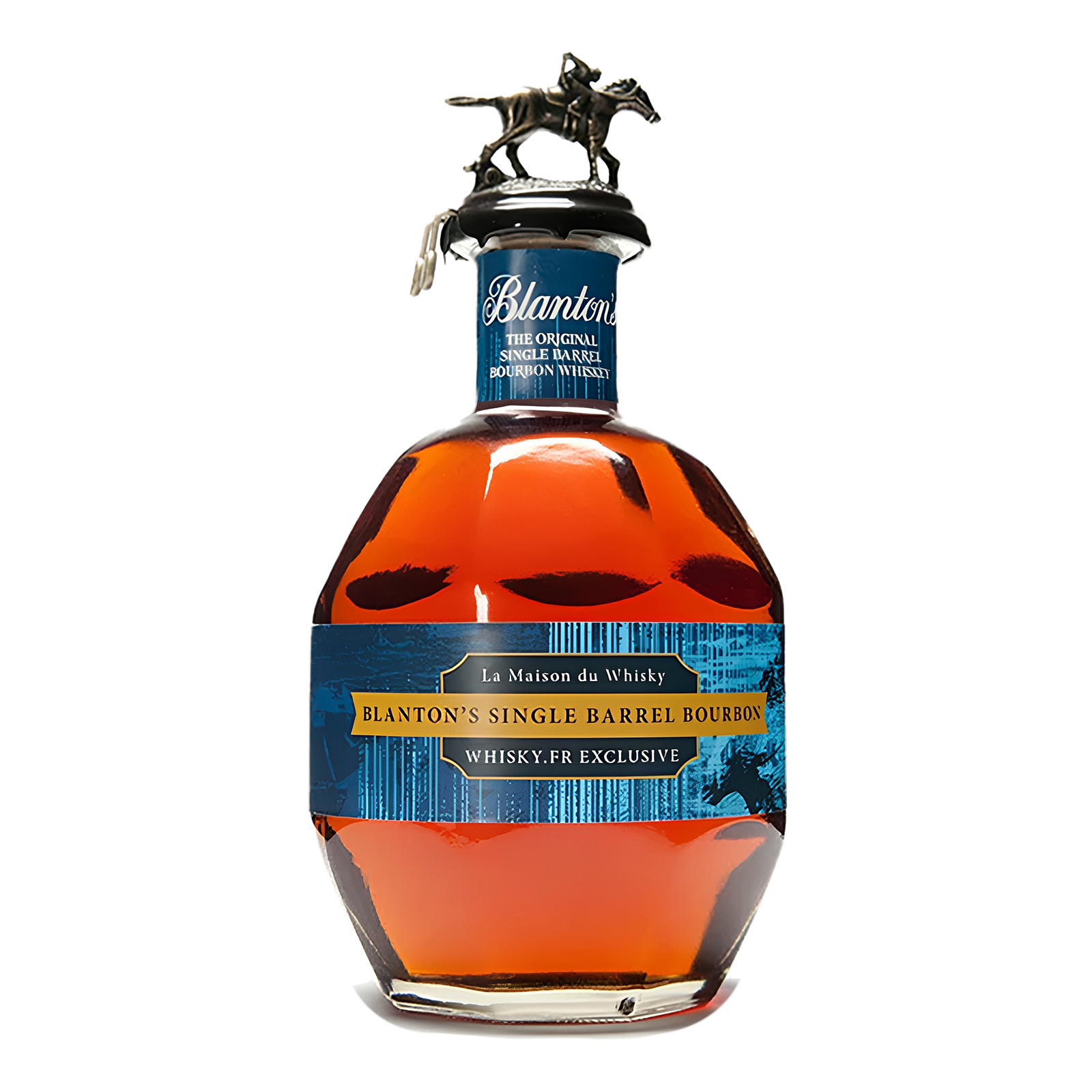
Blanton's Single Barrel Bourbon
WHISKY.FR Exclusive LabelsCredits:
BORN Agency
Bill Michul: Creative Director, Designer
Jeremy Richie: Designer-Illustrator
Jen Larkin: Account Director -
SILVER - Issued by American Advertising Federation (AAF) Lexington · Feb 2015
Packaging - Single Unit
Blanton's Single Barrel Bourbon
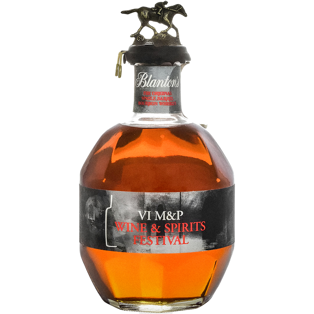
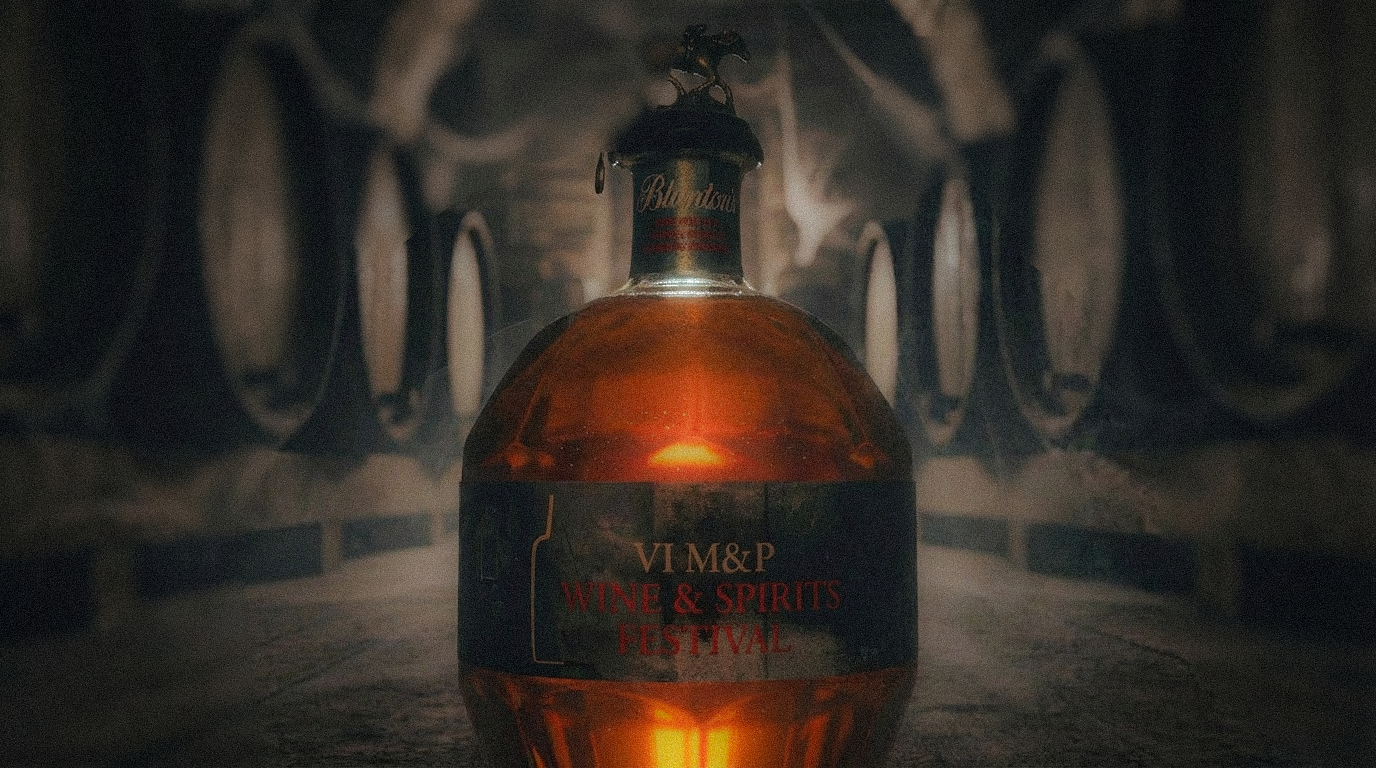
M&P Limited Edition Lables
Credits:
BORN Agency
Bill Michul: Creative Director
Jeremy Richie: Designer, Illustrator
Jen Larkin: Account Director
The lore
Two very different yet equally rare Blanton’s single-barrel releases illustrate how geographic exclusivity and limited availability drive desirability far beyond the standard lineup. The Blanton’s Edition Whisky.fr was a one-off single barrel selected exclusively for La Maison du Whisky’s Whisky.fr platform, bottled at 50% ABV with just 480 bottles released and commanding around €2,700 (~$2,900) on the European market—a price that reflects its collector status and scarcity. In contrast, the Blanton’s M&P Special Poland Release, released in 2015 and created for the VI M&P Wine & Spirits Festival, is an ultra-rare single barrel typically trading from roughly $1,700 up to $3,000+ on secondary markets—an indicator of both its festival-exclusive origin and intense collector demand. Both bottles are defined not by broad distribution but by single barrels, singular contexts, and finite runs, making them standout artifacts in Blanton’s catalog.
Inspiration
The Whisky.fr exclusive was designed to capture the atmosphere and energy of the Kentucky Derby, translating movement, anticipation, and ceremony into a vibrant yet restrained label system. Color, contrast, and composition work together to evoke the spectacle of race day while maintaining a sense of luxury appropriate to a curated, retailer-exclusive release.
In contrast, the Poland M&P festival bottle draws its inspiration from the cellars and tasting rooms of the region, emphasizing depth, intimacy, and tradition. The design leans into quieter cues—materiality, tone, and balance—reflecting spaces where whiskey is experienced slowly and deliberately rather than on display.
Together, the two bottles explore how place and atmosphere can shape packaging direction, using design not as decoration, but as an extension of context.